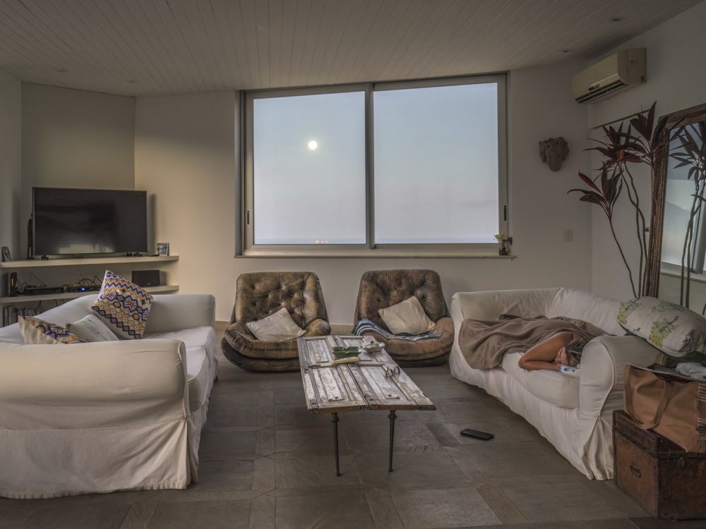
 Harbour flat
Living rooms · Bergen, Norway · 96 m² · 2025
Harbour flat
Living rooms · Bergen, Norway · 96 m² · 2025
Rooms people stay in
Every colour on this site was measured from the rooms themselves. Nothing here was picked from a swatch book, including the floor you are reading this on.
The studio palette
Not a brand guideline. This is every colour in the practice's work, clustered and weighted by how much of each room it actually covered — across 10 projects.
-
#BCB2AA23.1% -
#4B382A19.6% -
#92796017.9% -
#21365915.2% -
#5E5E6015.2% -
#BD8B538.9%
Harbour flat
Living rooms · Bergen, Norway · 96 m² · 2025
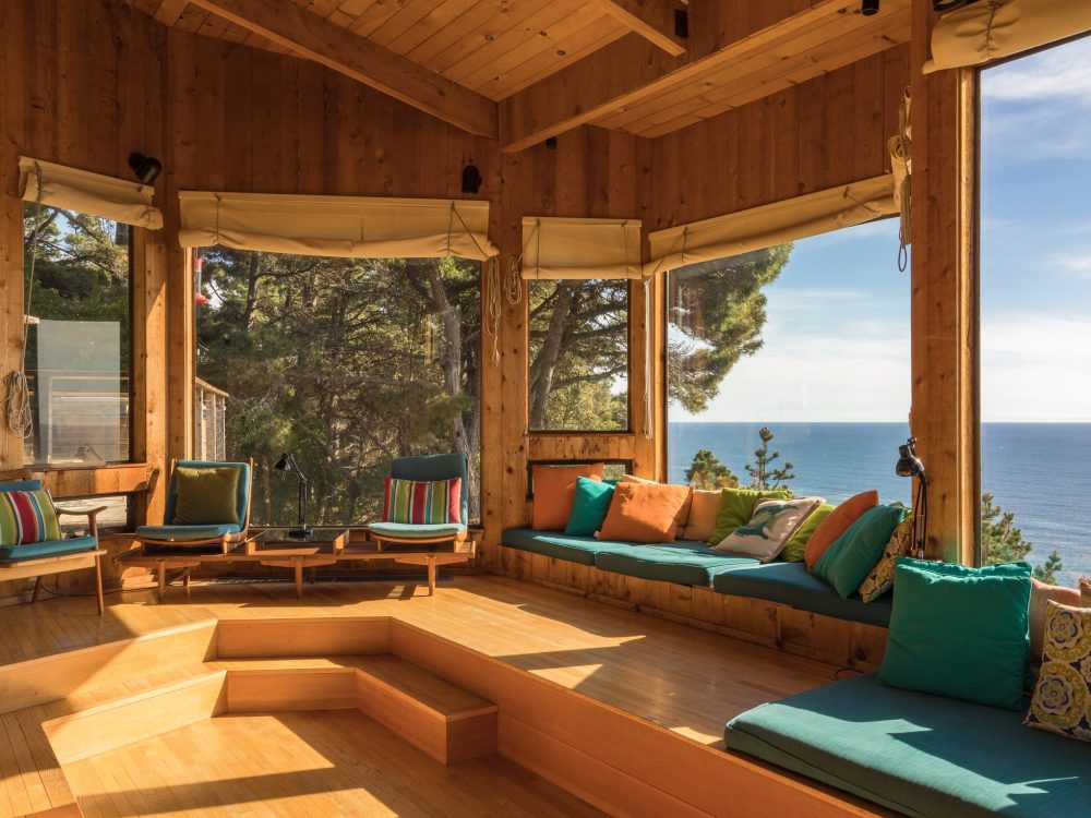
 Lantern house
Living rooms · Sea Ranch, California · 184 m² · 2024
Lantern house
Living rooms · Sea Ranch, California · 184 m² · 2024
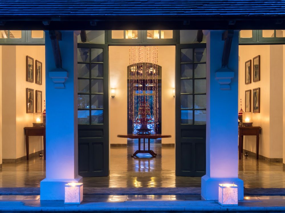
 The long room
Places to gather · Luang Prabang, Laos · 210 m² · 2024
The long room
Places to gather · Luang Prabang, Laos · 210 m² · 2024
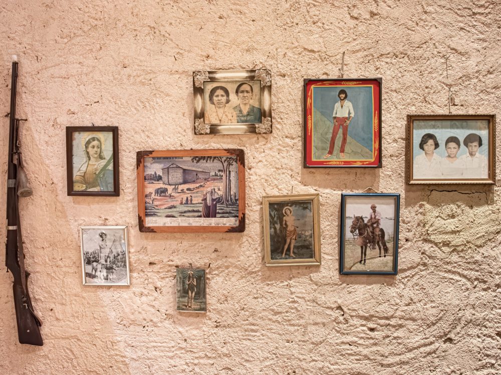 Apartment in a modernist block
Living rooms · São Paulo, Brazil · 128 m² · 2023
Apartment in a modernist block
Living rooms · São Paulo, Brazil · 128 m² · 2023
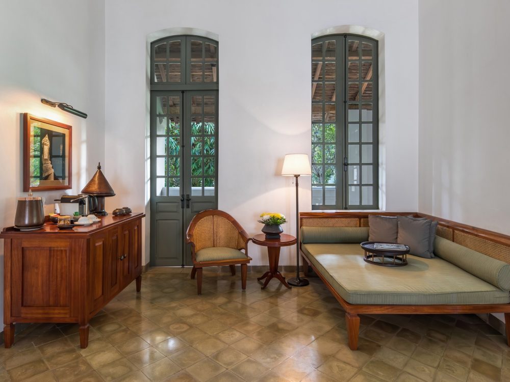 Farmhouse, rebuilt around the table
Living rooms · Ceará, Brazil · 74 m² · 2023
Farmhouse, rebuilt around the table
Living rooms · Ceará, Brazil · 74 m² · 2023
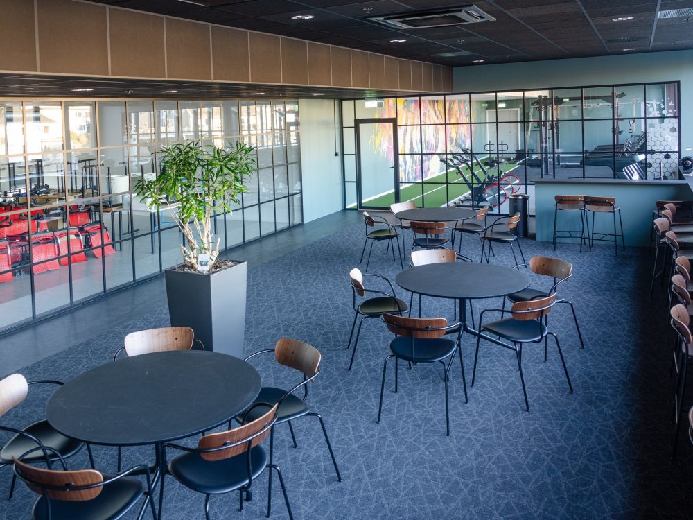 Garden suite
Bedrooms · Luang Prabang, Laos · 62 m² · 2025
Garden suite
Bedrooms · Luang Prabang, Laos · 62 m² · 2025
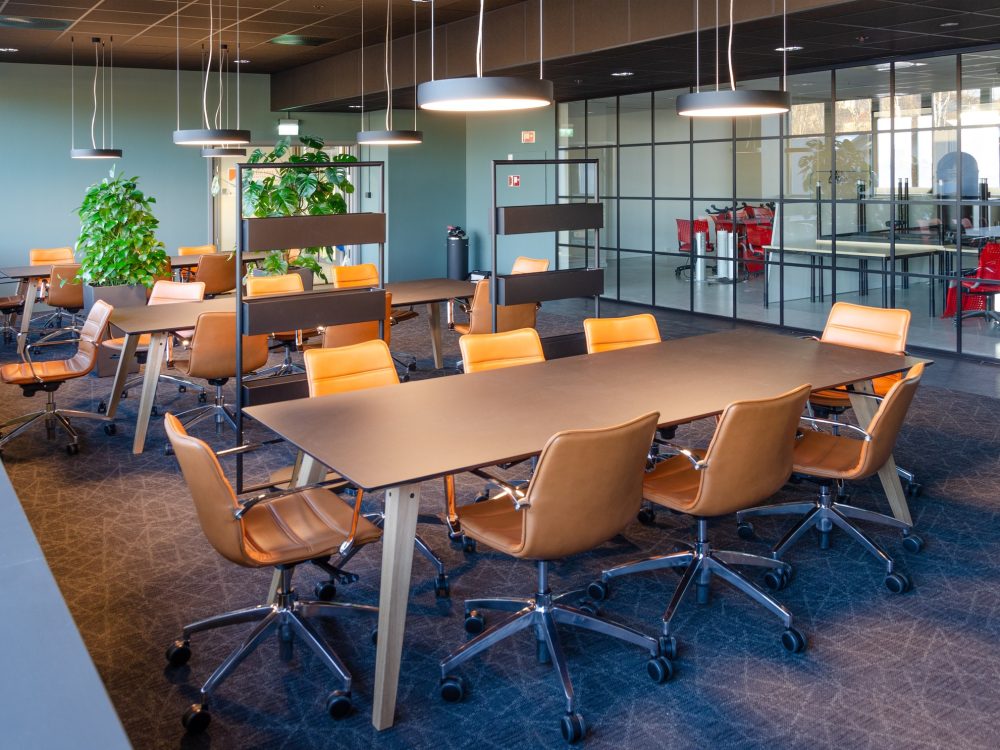 Academy lounge
Rooms for working · Drammen, Norway · 240 m² · 2025
Academy lounge
Rooms for working · Drammen, Norway · 240 m² · 2025
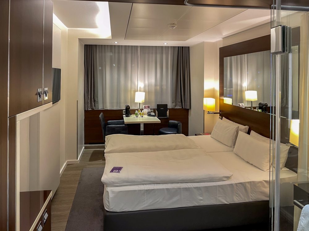 Academy study rooms
Rooms for working · Drammen, Norway · 160 m² · 2025
Academy study rooms
Rooms for working · Drammen, Norway · 160 m² · 2025
How the colour gets here
Worked through on Harbour flat, which is a real project on this site and not an illustration of one.
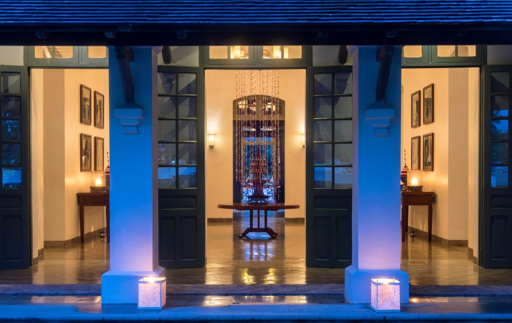
-
Sampled, small
The picture is reduced to a 72-pixel thumbnail. Every pixel of it becomes one observation — which is the point of shrinking it, not a shortcut: at full size a single cushion outvotes a wall.
-
Converted to Lab
Clustering in RGB puts a sofa and the shadow behind it in the same group, because RGB distance has almost nothing to do with how different two colours look. CIE Lab was built so that distance does.
-
Clustered into six
k-means, seeded across the lightness range rather than at random, so the same room measures the same way twice. A random seed gives a different palette every time you press save.
-
Ordered by how much room it covers
Not by how striking it is. The largest area in almost every room is a wall, which is why the accent below is never the first swatch.
#151827
21.1% of the room
#D39F66
19.5% of the room
#12346B
17.5% of the room
#4F494F
15.3% of the room
#856444
14.3% of the room
#3E74C8
12.4% of the room
Everything we have measured
Each bar is one project. Each band is as wide as that colour is common in the room it came from. Nothing here was arranged.
What the rooms have in common
Every swatch from all 10 rooms, weighted by how much of its room it covered. Yellows and ochres come to 47% of the studio's work — which is a fact about us, not a position we took.
- Yellows and ochres
- 47.1%
- Neutrals
- 36.1%
- Blues
- 15.1%
- Reds and terracottas
- 1.8%
Bring us a photograph of the room
Not a mood board. A photograph of the room as it is now, badly lit, with the wrong sofa in it. That is the thing we can measure, and everything on this site started as one.